
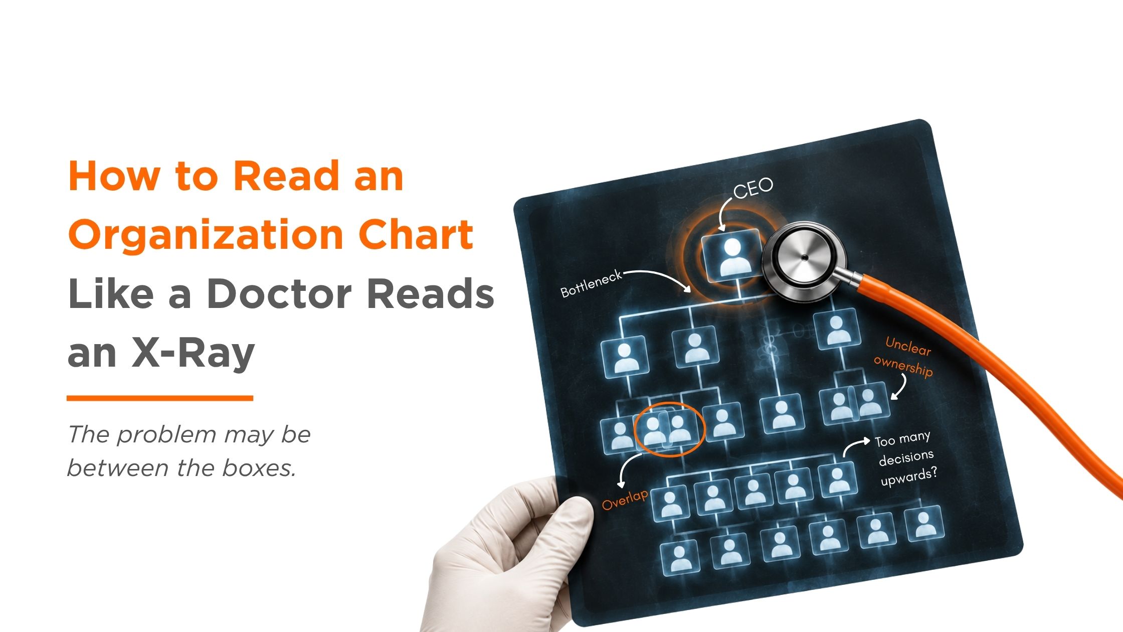
An organizational chart can look perfectly healthy.
Clean boxes.
Straight lines.
Neat job titles.
Everyone seems to have a place.
And yet…
A simple decision takes three weeks.
Two teams are doing almost the same thing.
Everyone is “responsible,” but nobody knows who is actually accountable.
And somehow, every road still leads back to the CEO.
The chart looks fine.
The organization doesn’t.
Maybe the problem is that we have been looking at organograms the wrong way.
The Organization Chart Is the X-Ray
Think about visiting a doctor.
An X-ray doesn’t tell the doctor everything about your health. It gives them a picture.
They look at the image, notice something unusual, ask questions, run a few more tests, and then try to understand what is actually happening underneath.
An organizational chart works much the same way.
It shows us where people sit.
But it doesn’t always show us how work moves.
And that distinction matters.
Research on organizational structure has long pointed to the connection between structure, information flow, and decision-making. The way an organization is arranged can influence how information travels, who sees what, and where decisions eventually land. (Joseph & Gaba, 2020)
So perhaps instead of asking:
“Does our organizational chart look good?”
we should ask:
“What is this organizational chart telling us about how the organization actually works?”
That is where the interesting part begins.
Symptom #1: The Approval Traffic Jam
Picture this.
A team needs to make a relatively small decision.
The Employee asks the Supervisor.
The Supervisor asks the Manager.
The Manager asks the Department Head.
The Department Head wants the Director’s view.
The Director says, “Let’s check with the CEO.”
And suddenly, a decision that could have taken 20 minutes has become a week-long email thread.
Sound familiar?
Sometimes the problem isn’t that people don’t know what to do.
They simply don’t know who has the actual authority to do it.
An organizational chart may show who reports to whom, but it doesn’t necessarily show who gets to decide what.
And that is a very different question.
In fact, good organizational design isn’t just about who reports to whom. It’s also about how much autonomy people have to make decisions where the work actually happens.
A healthy structure doesn’t mean every decision goes upward.
Sometimes, the healthiest thing an organization can do is let the decision stay close to the person who has the information needed to make it.
Symptom #2: Two Boxes, One Job
Here’s another familiar scene.
Marketing creates a report.
Business Development creates a similar report.
Strategy asks for another version of the same information.
Three people are working hard.
Everyone is busy.
And somehow, nobody is actually getting more work done.
This is what organizational “overlap” can look like.
On paper, the teams may have completely different names.
In practice?
Their work may be sitting on top of each other.
The problem isn’t always duplication itself. Some overlap is useful.
The problem is unclear ownership.
When two teams both believe they own something, decisions slow down.
When neither team believes they own it, things disappear into the gap.
That little gap between two boxes can sometimes be more important than the boxes themselves.
Symptom #3: Everyone Is Responsible
One of the strangest phrases in organizations is:
“Everyone is responsible for this.”
Sounds collaborative.
Until something goes wrong.
Then suddenly:
“Wasn’t that their responsibility?”
“No, we only support them.”
“I thought they were handling it.”
“We were waiting for approval.”
And the search for accountability begins.
This is where an organizational chart can be misleading.
A person can have a title without having real decision authority.
A team can have a responsibility without having the resources to deliver it.
And a Manager can appear to own an outcome without actually controlling the things that influence it.
The boxes tell you who exists.
They don’t always tell you who owns the outcome.
Symptom #4: The CEO Is the Wi-Fi Router
Everything connects to one person.
Hiring? CEO.
Pricing? CEO.
Customer complaint? CEO.
Small purchase? CEO.
Team conflict? CEO.
Someone needs a decision?
“Let’s ask the CEO.”
At first, this can look like strong leadership.
But eventually, the CEO becomes the organization’s Wi-Fi router.
Everyone needs a connection.
And when the router gets overloaded, the whole organization slows down.
This is not necessarily a leadership problem.
Sometimes it is a design problem.
If too many decisions keep moving upward, the structure may not be giving people enough clarity, authority, or confidence to act where the work actually happens.
And that creates an interesting paradox:
The more decisions a leader personally solves, the less time they have to solve the decisions only they can solve.
But Here’s the Thing About X-Rays…
A doctor doesn’t treat an X-ray.
They treat the patient.
That distinction matters in organizations too.
It is tempting to look at a messy organizational chart and immediately think:
“Let’s reorganize.”
Move this box.
Create a new department.
Change some titles.
Add a reporting line.
Done.
Except… maybe not.
Research by Blenko, Mankins, and Rogers found that fewer than one-third of the 57 reorganizations they studied produced significant performance improvement. Their argument was simple: changing structure matters only when it helps an organization make important decisions better and faster.
In other words:
A prettier organizational chart is not necessarily a healthier organization.
Sometimes the structure is not the real problem.
Sometimes it is the way people communicate.
Sometimes it is unclear decision-making.
Sometimes it is duplicated work.
Sometimes it is a capability gap.
Sometimes it is leadership behavior.
And sometimes… the boxes are completely fine.
The problem is between them.
So, What Should We Look For?
When reading an organizational chart, don’t just follow the lines.
Follow the work.
Ask:
- Where does a decision start?
- Where does it get stuck?
- Who has the information?
- Who has the authority?
- Where does work get duplicated?
- Where does responsibility become unclear?
- Which decisions unnecessarily travel upward?
- Which teams need to coordinate but rarely talk?
Now the organizational chart becomes more than a collection of boxes.
It becomes a map of organizational health.
And suddenly, those little lines start telling a much bigger story.
A Healthy Organization Doesn’t Always Look Simple
This is important.
A good organizational chart does not necessarily mean a flat organization with five boxes and no hierarchy.
Different organizations need different structures.
A hospital cannot be organized exactly like a software startup.
A manufacturing company cannot coordinate work exactly like a creative agency.
A growing company may need a different structure six months from now than it needed two years ago.
Good organizational design is about the fit, between the structure, the work, the people, and the environment.
So the goal isn’t:
“How do we make our organizational chart simpler?”
The better question is:
“Does our structure help the right people make the right decisions at the right time?”
That is a much harder question.
But it is also a much more useful one.
Read the Chart. Then Read Between the Lines.
Maybe the next time you look at your organization’s organizational chart, don’t immediately start counting boxes.
Look for the symptoms.
- Where are the bottlenecks?
- Where are the overlaps?
- Where is accountability blurry?
- Where is information getting stuck?
- Where is one person carrying too much?
Because an organizational chart is only the picture.
The real organization is everything happening behind it.
At JDRC, we look at organizational challenges through a Diagnose → Design → Develop → Deliver lens.
Because before redesigning the boxes, it helps to understand what the organization is actually telling us.
Sometimes, the answer isn’t another box.
Sometimes, it is a clearer decision.
A better connection.
A missing capability.
Or simply permitting the right person to act.
The chart is the X-ray.
The organization is the patient.
And good organizational design begins when we stop looking only at the picture and start asking what it is trying to tell us.